Ligature (writing): Difference between revisions
WikiKnight (talk | contribs) Created page with "{{short description|Glyph combining two or more letterforms}} thumb|class=skin-invert-image|The letters {{angbr|s}} and {{angbr|t}} combined to create the ligature {{angbr|st}} thumb|right|[[Wood type sorts with ligatures of (from left to right) {{angbr|fl}}, {{angbr|ft}}, {{angbr|ff}}, {{angbr|fi}}; in 20 Cicero = 240 point (typography..." |
(No difference)
|
Latest revision as of 15:31, 8 July 2025
Template:Short description


Template:Contains special characters Template:Orthography notation
In writing and typography, a ligature occurs where two or more graphemes or letters are joined to form a single glyph. Examples are the characters Template:Angbr and Template:Angbr used in English and French, in which the letters Template:Angbr and Template:Angbr are joined for the first ligature and the letters Template:Angbr and Template:Angbr are joined for the second ligature. For stylistic and legibility reasons, Template:Angbr and Template:Angbr are often merged to create Template:Angbr (where the tittle on the Template:Angbr merges with the hood of the Template:Angbr); the same is true of Template:Angbr and Template:Angbr to create Template:Angbr. The common ampersand, Template:Angbr, developed from a ligature in which the handwritten Latin letters Template:Angbr and Template:Angbr (spelling Template:Lang, Latin for 'and') were combined.[1]
History
Template:See also The earliest known script Sumerian cuneiform and Egyptian hieratic both include many cases of character combinations that gradually evolve from ligatures into separately recognizable characters. Other notable ligatures, such as the Brahmic abugidas and the Germanic bind rune, figure prominently throughout ancient manuscripts. These new glyphs emerge alongside the proliferation of writing with a stylus, whether on paper or clay, and often for a practical reason: faster handwriting. Merchants especially needed a way to speed up the process of written communication and found that conjoining letters and abbreviating words for lay use was more convenient for record keeping and transaction than the bulky long forms.Template:Citation needed

Around the 9th and 10th centuries, monasteries became a fountainhead for these types of script modifications. Medieval scribes who wrote in Latin increased their writing speed by combining characters and by introducing notational abbreviations. Others conjoined letters for aesthetic purposes. For example, in blackletter, letters with right-facing bowls (Template:Angbr, Template:Angbr, and Template:Angbr) and those with left-facing bowls (Template:Angbr, Template:Angbr, Template:Angbr, Template:Angbr, Template:Angbr and Template:Angbr) were written with the facing edges of the bowls superimposed. In many script forms, characters such as Template:Angbr, Template:Angbr, and Template:Angbr had their vertical strokes superimposed.Template:Citation needed Scribes also used notational abbreviations to avoid having to write a whole character in one stroke. Manuscripts in the fourteenth century employed hundreds of such abbreviations.Template:Citation needed

In handwriting, a ligature is made by joining two or more characters in an atypical fashion by merging their parts, or by writing one above or inside the other. In printing, a ligature is a group of characters that is typeset as a unit, so the characters do not have to be joined. For example, in some cases the Template:Angbr ligature prints the letters Template:Angbr and Template:Angbr with a greater separation than when they are typeset as separate letters. When printing with movable type was invented around 1450,[4] typefaces included many ligatures and additional letters, as they were based on handwriting. Ligatures made printing with movable type easier because one sort would replace frequent combinations of letters and also allowed more complex and interesting character designs which would otherwise collide with one another.Template:Citation needed
Because of their complexity, ligatures began to fall out of use in the 20th century. Sans serif typefaces, increasingly used for body text, generally avoid ligatures, though notable exceptions include Gill Sans and Futura. Inexpensive phototypesetting machines in the 1970s (which did not require journeyman knowledge or training to operate) also generally avoid them. A few, however, became characters in their own right, see below the sections about German ß, various Latin accented letters, & et al.
The trend against digraph use was further strengthened by the desktop publishing revolution. Early computer software in particular had no way to allow for ligature substitution (the automatic use of ligatures where appropriate), while most new digital typefaces did not include ligatures. As most of the early PC development was designed for the English language (which already treated ligatures as optional at best) dependence on ligatures did not carry over to digital. Ligature use fell as the number of traditional hand compositors and hot metal typesetting machine operators dropped because of the mass production of the IBM Selectric brand of electric typewriter in 1961. A designer active in the period commented: "some of the world's greatest typefaces were quickly becoming some of the world's worst fonts."[5]
Ligatures have grown in popularity in the 21st century because of an increasing interest in creating typesetting systems that evoke arcane designs and classical scripts. One of the first computer typesetting programs to take advantage of computer-driven typesetting (and later laser printers) was Donald Knuth's TeX program. Now the standard method of mathematical typesetting, its default fonts are explicitly based on nineteenth-century styles. Many new fonts feature extensive ligature sets; these include FF Scala, Seria and others by Martin Majoor and Hoefler Text by Jonathan Hoefler. Mrs Eaves by Zuzana Licko contains a particularly large set to allow designers to create dramatic display text with a feel of antiquity. A parallel use of ligatures is seen in the creation of script fonts that join letterforms to simulate handwriting effectively. This trend is caused in part by the increased support for other languages and alphabets in modern computing, many of which use ligatures somewhat extensively. This has caused the development of new digital typesetting techniques such as OpenType, and the incorporation of ligature support into the text display systems of macOS, Windows, and applications like Microsoft Office. An increasing modern trend is to use a "Th" ligature which reduces spacing between these letters to make it easier to read, a trait infrequent in metal type.[6][7][8]
Today, modern font programming divides ligatures into three groups, which can be activated separately: standard, contextual and historical. Standard ligatures are needed to allow the font to display without errors such as character collision. Designers sometimes find contextual and historic ligatures desirable for creating effects or to evoke an old-fashioned print look.Template:Citation needed
Latin alphabet
Stylistic ligatures

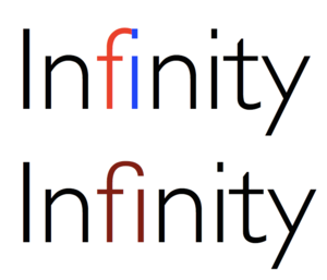
Many ligatures combine Template:Angbr with the following letter. A particularly prominent example is Template:Angbr (or Template:Angbr, rendered with two normal letters). The tittle of the Template:Angbr in many typefaces collides with the hood of the Template:Angbr when placed beside each other in a word, and are combined into a single glyph with the tittle absorbed into the Template:Angbr. Other ligatures with the letter f include Template:Angbr,Template:Efn Template:Angbr (Template:Angbr), Template:Angbr (Template:Angbr), Template:Angbr (Template:Angbr), and Template:Angbr (Template:Angbr). In Linotype, ligature matrices for Template:Angbr, Template:Angbr, Template:Angbr, Template:Angbr, Template:Angbr, Template:Angbr, Template:Angbr, Template:Angbr, Template:Angbr, Template:Angbr, and for Template:Angbr followed by a full stop, comma, or hyphen are optional in many typefaces,[9] as well as the equivalent set for the doubled Template:Angbr, as a method to overcome the machine's physical restrictions.Template:Citation needed
These arose because with the usual type sort for lowercase Template:Angbr, the end of its hood is on a kern, which would be damaged by collision with raised parts of the next letter.Template:Citation needed
Ligatures crossing the morpheme boundary of a composite word are sometimes considered incorrect, especially in official German orthography as outlined in the Duden. An English example of this would be Template:Angbr in shelfTemplate:Zwnjful; a German example would be Template:Lang ("boat trip").Template:Efn Some computer programs (such as TeX) provide a setting to disable ligatures for German, while some users have also written macros to identify which ligatures to disable.[10][11]

Turkish distinguishes dotted and dotless "I". If a ligature with f were to be used in words such as Template:Lang [oven] and Template:Lang [idea], this contrast would be obscured. The Template:Angbr ligature, at least in the form typical to other languages, is therefore not used in Turkish typography.Template:Citation needed
Remnants of the ligatures Template:Angbr /Template:Angbr ("sharp s", Template:Lang) and Template:Angbr/Template:Angbr ("sharp t", Template:Lang) from Fraktur, a family of German blackletter typefaces, originally mandatory in Fraktur but now employed only stylistically, can be seen to this day on street signs for city squares whose name contains Template:Lang or ends in Template:Lang. Instead, the "sz" ligature has merged into a single character, the German ß – see below.
Sometimes, ligatures for Template:Angbr (Template:Angbr), Template:Angbr (Template:Angbr), Template:Angbr, Template:Angbr, Template:Angbr, Template:Angbr and Template:Angbr are used (e.g. in the typeface Linux Libertine).Template:Citation needed
Besides conventional ligatures, in the metal type era some newspapers commissioned custom condensed single sorts for the names of common long names that might appear in news headings, such as "Eisenhower", "Chamberlain". In these cases the characters did not appear combined, just more tightly spaced than if printed conventionally.[12]
German ß

The German letter Template:Angbr (Template:Lang, also called the Template:Lang, meaning sharp s) is an official letter of the alphabet in Germany and Austria. A recognizable ligature representing the Template:Angbr digraph develops in handwriting in the early 14th century.[13] Its name Template:Lang (meaning S-Z) suggests a connection of "long s and z" (ſʒ) but the Latin script also knows a ligature of "long s over round s" (ſs). Since German was mostly set in blackletter typefaces until the 1940s, and those typefaces were rarely set in uppercase, a capital version of the Template:Lang never came into common use, even though its creation has been discussed since the end of the 19th century. Therefore, the common replacement in uppercase typesetting was originally SZ (Template:Lang "measure" → Template:Lang, different from Template:Lang "mass" → Template:Lang) and later SS (Template:Lang → Template:Lang). Until 2017, the SS replacement was the only valid spelling according to the official orthography in Germany and Austria. In Switzerland, the ß is omitted altogether in favour of ss. The capital version (ẞ) of the Eszett character was occasionally used since 1905/06, has been part of Unicode since 2008, and has appeared in more and more typefaces. Since the end of 2010, the Template:Lang has suggested the new upper case character for "ß" rather than replacing it with "SS" or "SZ" for geographical names.[14] A new standardized German keyboard layout (DIN 2137-T2) has included the capital ß since 2012. The new character entered the official orthographic rules in June 2017.Template:Citation needed
Massachusett ꝏ
A prominent feature of the colonial orthography created by John Eliot (later used in the first Bible printed in the Americas, the Massachusett-language Template:Lang, published in 1663) was the use of the double-o ligature Template:Angbr to represent the Template:IPAslink of food as opposed to the Template:IPAslink of hook (although Eliot himself used Template:Angbr and Template:Angbr interchangeably).Template:Clarify In the orthography in use since 2000 in the Wampanoag communities participating in the Wôpanâak Language Reclamation Project (WLRP), the ligature was replaced with the numeral Template:Angbr, partly because of its ease in typesetting and display as well as its similarity to the o-u ligature Template:Angbr used in Abenaki. For example, compare the colonial-era spelling Template:Lang[15] with the modern Wôpanâak Language Reclamation Project (WLRP) spelling Template:Lang.[16]
Letter W
As the letter Template:Angbr is an addition to the Latin alphabet that originated in the seventh century, the phoneme it represents was formerly written in various ways. In Old English, the runic letter wynn Template:Angbr) was used, but Norman influence forced wynn out of use. By the 14th century, the "new" letter Template:Angbr, originated as two Template:Angbr glyphs or Template:Angbr glyphs joined, developed into a legitimate letter with its own position in the alphabet. Because of its relative youth compared to other letters of the alphabet, only a few European languages (including Breton, Dutch, English, German, Maltese, Polish, Walloon, and Welsh) use the letter in native words.Template:Citation needed
Æ and Œ

The character Template:Angbr (lower case Template:Angbr; in ancient times named Template:Lang) when used in Danish, Norwegian, Icelandic, or Old English is not a typographic ligature. It is a distinct letter — a vowel — and when collated, may be given a different place in the alphabetical order than Template:Char.Template:Citation needed
In modern English orthography, Template:Angbr is not considered an independent letter but a spelling variant, for example: "encyclopædia" versus "encyclopaedia" or "encyclopedia". In this use, Template:Angbr comes from Medieval Latin, where it was an optional ligature in some specific words that had been transliterated and borrowed from Ancient Greek, for example, "Æneas". It is still found as a variant in English and French words descended or borrowed from Medieval Latin, but the trend has recently been towards printing the Template:Angbr and Template:Angbr separately.[17]
Similarly, Template:Angbr and Template:Angbr, while normally printed as ligatures in French, are replaced by component letters if technical restrictions require it.Template:Citation needed
Umlaut
In German orthography, the umlauted vowels Template:Angbr, Template:Angbr, and Template:Angbr historically arose from Template:Angbr, Template:Angbr, Template:Angbr ligatures (strictly, from these vowels with a small letter Template:Angbr written as a diacritic, for example Template:Angbr, Template:Angbr, Template:Angbr). It is common practice to replace them with Template:Angbr, Template:Angbr, Template:Angbr digraphs when the diacritics are unavailable, for example in electronic conversation. Phone books treat umlauted vowels as equivalent to the relevant digraph (so that a name Müller will appear at the same place as if it were spelled Mueller; German surnames have a strongly fixed orthography, either a name is spelled with Template:Angbr or with Template:Angbr); however, the alphabetic order used in other books treats them as equivalent to the simple letters Template:Angbr, Template:Angbr and Template:Angbr. The convention in Scandinavian languages and Finnish is different: there the umlaut vowels are treated as independent letters with positions at the end of the alphabet.Template:Citation needed
Middle English
.png)
In Middle English, the word the (written þe) was frequently abbreviated as Template:Angbr, a Template:Angbr (thorn) with a small Template:Angbr written as a diacritic. Similarly, the word that was abbreviated to Template:Angbr, a Template:Angbr with a small Template:Angbr written as a diacritic. During the latter Middle English and Early Modern English periods, the thorn in its common script, or cursive, form came to resemble a Template:Angbr shape. With the arrival of movable type printing, the substitution of Template:Angbr for Template:Angbr became ubiquitous, leading to the common "ye", as in 'Ye Olde Curiositie Shoppe'. One major reason for this was that Template:Angbr existed in the printer's types that William Caxton and his contemporaries imported from Belgium and the Netherlands, while Template:Angbr did not.[18]
Ring
The ring diacritic used in vowels such as Template:Angbr likewise originated as an Template:Angbr -ligature.[19] Before the replacement of the older "aa" with "å" became a Template:Lang practice, an "a" with another "a" on top (aͣ) could sometimes be used, for example in Johannes Bureus's, Runa: ABC-Boken (1611).[20] The Template:Angbr ligature ů in particular saw use in Early Modern High German, but it merged in later Germanic languages with Template:Angbr (e.g. MHG Template:Lang, ENHG Template:Lang, Modern German Template:Lang "foot"). It survives in Czech, where it is called Template:Lang.
Hwair
The letter hwair Template:Angbr, used only in transliteration of the Gothic language, resembles a Template:Angbr ligature. It was introduced by philologists around 1900 to replace the digraph Template:Angbr formerly used to express the phoneme in question, e.g. by Migne in the 1860s (Template:Lang vol. 18).
Byzantine Ȣ
The Byzantines had a unique o-u ligature Template:Angbr that, while originally based on the Greek alphabet's ο-υ, carried over into Latin alphabets as well. This ligature is still seen today on icon artwork in Greek Orthodox churches, and sometimes in graffiti or other forms of informal or decorative writing.Template:Citation needed
Gha (OI)
Gha Template:Angbr (File:Latin small letter Reversed thorn.svg), a rarely used letter based on Q and G, was misconstrued by the ISO to be an OI ligature because of its appearance, and is thus known (to the ISO and, in turn, Unicode) as "Oi". Historically, it was used in many Latin-based orthographies of Turkic (e.g., Azerbaijani) and other central Asian languages.Template:Citation needed
International Phonetic Alphabet
The International Phonetic Alphabet formerly used ligatures to represent affricate consonants, of which six are encoded in Unicode: Template:IPA and Template:IPA. One fricative consonant is still represented with a ligature: Template:IPA, and the extensions to the IPA contain three more: Template:IPA, Template:IPA and Template:IPA.Template:Citation needed
Initial Teaching Alphabet
The Initial Teaching Alphabet, a short-lived alphabet intended for young children, used a number of ligatures to represent long vowels: Template:Angbr, Template:Angbr, Template:Angbr, Template:Angbr, Template:Angbr, and ligatures for Template:Angbr, Template:Angbr and Template:Angbr that are not encoded in Unicode. Ligatures for consonants also existed, including ligatures of Template:Angbr, Template:Angbr, Template:Angbr, Template:Angbr, Template:Angbr and a reversed Template:Angbr with Template:Angbr (neither the reversed t nor any of the consonant ligatures are in Unicode).Template:Citation needed
Rare ligatures
Rarer ligatures also exist, including Template:Angbr; Template:Angbr; Template:Angbr; Template:Angbr; Template:Angbr (barred Template:Angbr); Template:Angbr; Template:Angbr, which is used in medieval Nordic languages for Template:IPAslink (a long close-mid back rounded vowel),[21] as well as in some orthographies of the Massachusett language to represent Template:IPA link (a long close back rounded vowel); Template:Angbr; Template:Angbr, which was used in Medieval Welsh to represent Template:IPA link (the voiceless lateral fricative);[21] Template:Angbr; Template:Angbr; Template:Angbr; and Template:Angbr have Unicode codepoints (in code block Latin Extended-E for characters used in German dialectology (Teuthonista),[22] the Anthropos alphabet, Sakha and Americanist usage).Template:Citation needed
Symbols originating as ligatures

The most common ligature in modern usage is the ampersand Template:Angbr . This was originally a ligature of Template:Angbr and Template:Angbr , forming the Template:Langx, meaning and. It has exactly the same use in French and in English. The ampersand comes in many different forms. Because of its ubiquity, it is generally no longer considered a ligature, but a logogram. Like many other ligatures, it has at times been considered a letter (e.g., in early Modern English); in English it is pronounced and, not et. In most typefaces, it does not immediately resemble the two letters used to form it, although certain typefaces use designs in the form of a ligature (examples include the original versions of Futura and Univers, Trebuchet MS, and Civilité, known in modern times as the italic of Garamond).Template:Citation needed
Similarly, the number sign Template:Angbr originated as a stylized abbreviation of the Roman term Template:Lang, written as Template:Angbr.[23] Over time, the number sign was simplified to how it is seen today, with two horizontal strokes across two slash-like strokes.[24] Now a logogram, the symbol is used mainly to denote (in the US) numbers, and weight in pounds.[25] It has also been used popularly on push-button telephones and as the hashtag indicator.[26]
The at sign Template:Angbr is possibly a ligature, but there are many different theories about the origin. One theory says that the French word Template:Lang (meaning at), was simplified by scribes who, instead of lifting the pen to write the grave accent, drew an arc around the Template:Angbr. Another states that it is short for the Latin word for toward, Template:Lang, with the Template:Angbr being represented by the arc. Another says it is short for an abbreviation of the term each at, with the Template:Angbr encasing the Template:Angbr.[27] Around the 18th century, it started being used in commerce to indicate price per unit, as "15 units @ $1".[28] After the popularization of Email, this fairly unpopular character became widely known, used to tag specific users.[29] Lately, it has been used to de-gender nouns in Spanish with no agreed pronunciation.[30]
The dollar sign Template:Angbr possibly originated as a ligature (for "pesos", although there are other theories as well) but is now a logogram.[31] At least once, the United States dollar used a symbol resembling an overlapping U-S ligature, with the right vertical bar of the U intersecting through the middle of the S ( US ) to resemble the modern dollar sign.[32]
The Spanish peseta was sometimes abbreviated by a ligature Template:Angbr (from Pts). The ligature Template:Angbr (F-with-bar) was proposed in 1968 by Édouard Balladur, Minister of Economy.[33] as a symbol for French franc but was never adopted and has never been officially used.[34]
.png)
In astronomy, the planetary symbol for Mercury (Template:Char) may be a ligature of Mercury's caduceus and a cross (which was added in the 16th century to Christianize the pagan symbol),[35] though other sources disagree;[36] the symbol for Venus Template:Char may be a ligature of the Greek letters Template:Angbr (phi) and Template:Angbr (kappa).[36] The symbol for Jupiter (Template:Char) descends from a Greek zeta with a horizontal stroke, Template:Angbr, as an abbreviation for Zeus.[35] [37] Saturn's astronomical symbol (Template:Char) has been traced back to the Greek Oxyrhynchus Papyri, where it can be seen to be a Greek kappa-rho with a horizontal stroke, as an abbreviation for Template:Lang (Cronus), the Greek name for the planet.[35] It later came to look like a lower-case Greek eta, with the cross added at the top in the 16th century to Christianize it. The dwarf planet Pluto is symbolized by a PL ligature, Template:Char.
A different PL ligature, Template:Char, represents the property line in surveying. Template:Citation needed
In engineering diagrams, a CL ligature, Template:Char, represents the center line of an object.Template:Citation needed
The interrobang Template:Angbr is an unconventional punctuation meant to combine the interrogation point (or the question mark) and the bang (printer's slang for exclamation mark) into one symbol, used to denote a sentence which is both a question and is exclaimed. For example, the sentence "Is that actually true‽" shows that the speaker is surprised while asking their question.[38]
Alchemy used a set of mostly standardized symbols, many of which were ligatures: 🜇 (AR, for aqua regia); 🜈 (S inside a V, for aqua vitae); 🝫 (MB, for Template:Lang [Mary's bath], a double boiler); 🝬 (VB, for Template:Lang, a steam bath); and 🝛 (aaa with overline, for amalgam).Template:Citation needed
Composer Arnold Schoenberg introduced two ligatures as musical symbols to denote melody and countermelody. The symbols are ligatures of HT and NT, 𝆦 and 𝆧, from the German for hauptstimme and nebenstimme respectively.[39][40]
Digraphs

.svg)
Digraphs, such as Template:Angbr in Spanish or Welsh, are not ligatures in the general case as the two letters are displayed as separate glyphs: although written together, when they are joined in handwriting or italic fonts the base form of the letters is not changed and the individual glyphs remain separate. Like some ligatures discussed above, these digraphs may or may not be considered individual letters in their respective languages. Until the 1994 spelling reform, the digraphs Template:Angbr and Template:Angbr were considered separate letters in Spanish for collation purposes. Catalan makes a difference between "Spanish ll" or palatalized l, written Template:Lang as in Template:Lang (law), and "French ll" or geminated l, written Template:Lang as in Template:Lang (colleague).Template:Citation needed
The difference can be illustrated with the French digraph Template:Lang, which is composed of the ligature Template:Lang and the simplex letter Template:Lang.Template:Citation needed
Dutch IJ
In Dutch, Template:Angbr can be considered a digraph, a ligature, or a letter in itself, depending on the standard used. Its uppercase and lowercase forms are often available as a single glyph with a distinctive ligature in several professional typefaces (e.g. Zapfino). Sans serif uppercase Template:Angbr glyphs, popular in the Netherlands, typically use a ligature resembling a Template:Angbr with a broken left-hand stroke. Adding to the confusion, Dutch handwriting can render Template:Angbr (which is not found in native Dutch words, but occurs in words borrowed from other languages) as a Template:Angbr-glyph without the dots in its lowercase form and the Template:Angbr in its uppercase form looking virtually identical (only slightly bigger). When written as two separate letters, both should be capitalizedTemplate:Snd or both notTemplate:Snd to form a correctly spelled word, like Template:Lang or Template:Lang (ice)[41].
Non-Latin alphabets


Ligatures are not limited to Latin script:
- The Armenian alphabet has the following ligatures: և (ե+ւ), ﬔ (մ+ե), ﬕ (մ+ի), ﬓ (մ+ն), ﬗ (մ+խ), ﬖ (վ+ն)
- Most Brahmic abugidas make frequent use of ligatures in consonant clusters. The number of ligatures employed is language-dependent; thus many more ligatures are conventionally used in Devanagari when writing Sanskrit than when writing Hindi. Having 37 consonants in total, the total number of ligatures that can be formed in Devanagari using only two letters is 1369, though few fonts are able to render all of them. In particular, Mangal, which is included with Microsoft Windows' Indic support, does not correctly handle ligatures with consonants attached to the right of the characters द, ट, ठ, ड, and ढ, leaving the virama attached to them and displaying the following consonant in its standard form.
- The Georgian script includes უ (uni), which is a combination of ო (oni) and the former letter ჳ (vie).
- A number of ligatures have been employed in the Greek alphabet, in particular a combination of omicron (Ο) and upsilon (Υ), which later gave rise to a letter of the Cyrillic script—see Ou (letter). Among the ancient Greek acrophonic numerals, ligatures were common (in fact, the ligature of a short-legged capital pi was a key feature of the acrophonic numeral system).
- Cyrillic ligatures: Љ, Њ, Ы, Ѿ. Iotated Cyrillic letters are ligatures of the early Cyrillic decimal I and another vowel: Ꙗ, Ѥ, Ѩ, Ѭ, Ю (sometimes also spelled ЮУ). In Serbian Cyrillic alphabet, the letters lje and nje (љ, њ), were developed as ligatures of Cyrillic used in Serbian Language, being El and En (л, н) with the soft sign (ь). They were invented by Vuk Stefanović Karadžić for use in his 1818 dictionary, replacing the earlier digraphs ⟨ль⟩ and ⟨нь⟩.[43] The Yae, a ligature of ya (Я) and e also exists: Ԙԙ, as do Dzze (Ꚉꚉ ← Д + З) and Zhwe (Ꚅꚅ ← З + Ж).
- Some forms of the Glagolitic script, used from Middle Ages to the 19th century to write some Slavic languages, have a box-like shape that lends itself to more frequent use of ligatures.
- Template:AnchorIn the Hebrew alphabet, the letters aleph (Template:Script/Hebrew) and lamed (Template:Script/Hebrew) can form a ligature, Template:Script/Hebrew. The ligature appears in some pre-modern texts (mainly religious), or in Judeo-Arabic texts, where that combination is very frequent, since [ʔ] [a]l- (written aleph plus lamed, in the Hebrew script) is the definite article in Arabic. For example, the word Allah (Template:Script/Hebrew) can be written with this ligature: Template:Script/Hebrew.
- In the Arabic alphabet, historically a cursive derived from the Nabataean alphabet, most letters' shapes depend on whether they are followed (word-initial), preceded (word-final) or both (medial) by other letters. For example, Arabic mīm, isolated Template:Lang, tripled (mmm, rendering as initial, medial and final): Template:Lang. Notable are the shapes taken by lām + ʼalif isolated: Template:Lang, and lām + ʼalif medial or final: Template:Lang. Besides the obligatory lām + ʼalif ligature, Arabic script grammar requires numerous stylistic ligatures.
- Syriac, a semitic alphabet derived from the Aramaic alphabet, has three different scripts that all use ligatures. Like Arabic, some letters change their form depending on their position in relation to other letters, and this can also change how ligatures look. A popular ligature all three scripts use is Lamadh Template:Script/Serto/Template:Script/Mdnh + Alap Template:Script/Serto/Template:Script/Mdnh isolated and final: (Serto) Template:Script/Serto, (Madnhaya) Template:Script/Mdnh. Another popular one is Taw Template:Script/Serto/Template:Script/Mdnh + Alap Template:Script/Serto/Template:Script/Mdnh, resulting in (Serto) Template:Script/Serto, (Madhnhaya) Template:Script/Mdnh. All three scripts use ligatures, but not in an equal spread or always with the same letters. Serto, being a flexible script, especially has many ligatures. For a wider, but not complete, list of Syriac ligatures, see Contextual forms of letters.
- Urdu (one of the main languages of South Asia), which uses a calligraphic version of the Arabic-based Nastaʿlīq script, requires a great number of ligatures in digital typography. InPage, a widely used desktop publishing tool for Urdu, uses Nastaliq fonts with over 20,000 ligatures.
- In American Sign Language a ligature of the American manual alphabet is used to sign "I love you", from the English initialism ILY. It consists of the little finger of the letter I plus the thumb and forefinger of the letter L. The letter Y (little finger and thumb) overlaps with the other two letters.
- The Japanese language has a number of obsolete kana ligatures. Of these, only two are widely available ones on computers: one for hiragana, ゟ, which is a vertical writing ligature of the characters よ and り; and one for katakana, ヿ, which is a vertical writing ligature of the characters コ and ト.
- Lao uses three ligatures, all comprising the letter ຫ (h). As a tonal language, most consonant sounds in Lao are represented by two consonants, which will govern the tone of the syllable. Five consonant sounds are only represented by a single consonant letter (ງ (ŋ), ນ (m), ມ (n), ລ (l), ວ (w)), meaning that one cannot render all the tones for words beginning with these sounds. A silent ຫ indicates that the syllable should be read with the tone rules for ຫ, rather than those of the following consonant. Three consonants can form ligatures with the letter ຫ. ຫ+ນ=ໜ (n), ຫ+ມ=ໝ (m) and ຫ+ລ=ຫຼ (l). ງ (ŋ) and ວ (w) just form clusters: ຫງ (ŋ) and ຫວ (w). ລ (l) can also be used written in a cluster rather than as a ligature: ຫລ (l).
- In many runic texts ligatures are common. Such ligatures are known as bind-runes and were optional.
Chinese ligatures

Written Chinese has a long history of creating new characters by merging parts or wholes of other Chinese characters. However, a few of these combinations do not represent morphemes but retain the original multi-character (multiple morpheme) reading and are therefore not considered true characters themselves. In Chinese, these ligatures are called Template:Lang (Template:Wikt-lang) or Template:Lang (Template:Lang); see polysyllabic Chinese characters for more.
One popular ligature used on Template:Lang decorations used for Chinese Lunar New Year is a combination of the four characters for Template:Lang (Template:Lang), meaning "ushering in wealth and fortune" and used as a popular New Year's greeting.
Template:Multiple image In 1924, Template:Lang (Template:Lang; 1898–1967) created the ligature Template:Lang from two of the three characters Template:Lang (Template:Lang), meaning "library".[44] Although it does have an assigned pronunciation of Template:Lang and appears in many dictionaries, it is not a morpheme and cannot be used as such in Chinese. Instead, it is usually considered a graphic representation of Template:Lang.
In recent years, a Chinese internet meme, the Grass Mud Horse, has had such a ligature associated with it combining the three relevant Chinese characters Template:Lang, Template:Lang, and Template:Lang (Template:Lang).
Similar to the ligatures were several "two-syllable Chinese characters" (Template:Wikt-lang) created in the 19th century as Chinese characters for SI units. In Chinese these units are disyllabic and standardly written with two characters, as Template:Lang Template:Lang "centimeter" (Template:Lang centi-, Template:Lang meter) or Template:Lang Template:Lang "kilowatt". However, in the 19th century these were often written via compound characters, pronounced disyllabically, such as Template:Lang for Template:Lang or Template:Lang for Template:Lang – some of these characters were also used in Japan, where they were pronounced with borrowed European readings instead. These have now fallen out of general use, but are occasionally seen.[45]
Japanese ligatures
The CJK Compatibility Unicode block features characters that have been combined into one square character in legacy character set so that it matches Japanese text. For example, the Japanese equivalent of "stock company", Template:Lang (Template:Transliteration) can be represented in 1 Unicode character Template:Angbr. Its romanized abbreviation Template:Transliteration can also be 1 character Template:Angbr. There are other Latin abbreviations such as kg for "kilogram" that can be ligated into 1 square character Template:Angbr.
Computer typesetting

The OpenType font format includes features for associating multiple glyphs to a single character, used for ligature substitution. Typesetting software may or may not implement this feature, even if it is explicitly present in the font's metadata. XeTeX is a TeX typesetting engine designed to make the most of such advanced features. This type of substitution used to be needed mainly for typesetting Arabic texts, but ligature lookups and substitutions are being put into all kinds of Western Latin OpenType fonts. In OpenType, there are standard liga, historical hlig, contextual clig, discretionary dlig and required rlig ligatures.
TeX
Opinion is divided over whether it is the job of writers or typesetters to decide where to use ligatures. TeX is an example of a computer typesetting system that makes use of ligatures automatically. The Computer Modern Roman typeface provided with TeX includes the five common ligatures Template:Angbr , Template:Angbr , Template:Angbr , Template:Angbr , and Template:Angbr . When TeX finds these combinations in a text, it substitutes the appropriate ligature, unless overridden by the typesetter.
CSS
CSS3 provides control over these properties using font-feature-settings,[46] though the CSS Fonts Module Level 4 draft standard indicates that authors should prefer several other properties.[47] Those include font-variant-ligatures, common-ligatures, discretionary-ligatures, historical-ligatures, and contextual.[48]
Ligatures in Unicode (Latin alphabets)
This table below shows discrete letter pairs on the left, the corresponding Unicode ligature in the middle column, and the Unicode code point on the right. Provided you are using an operating system and browser that can handle Unicode, and have the correct Unicode fonts installed, some or all of these will display correctly. See also the provided graphic.
Unicode maintains that ligaturing is a presentation issue rather than a character definition issue, and that, for example, "if a modern font is asked to display 'h' followed by 'r', and the font has an 'hr' ligature in it, it can display the ligature." Accordingly, the use of the special Unicode ligature characters is "discouraged", and "no more will be encoded in any circumstances".[49] (Unicode has continued to add ligatures, but only in such cases that the ligatures were used as distinct letters in a language or could be interpreted as standalone symbols. For example, ligatures such as æ and œ are not used to replace arbitrary "ae" or "oe" sequences; it is generally considered incorrect to write "does" as "dœs".)
Microsoft Word disables ligature substitution by default, largely for backward compatibility when editing documents created in earlier versions of Word. Users can enable automatic ligature substitution on the Advanced tab of the Font dialog box.
LibreOffice Writer enables standard ligature substitution by default for OpenType fonts, user can enable or disable any ligature substitution on the Features dialog box, which is accessible via the Features button of the Character dialog box, or alternatively, input a syntax with font name and feature into the Font Name input box, for example: Noto Sans:liga=0.
| Non-ligature | Ligature[49] | Unicode | HTML |
|---|---|---|---|
| AA, aa | Ꜳ, ꜳ[21] | U+A732, U+A733 | Ꜳ ꜳ |
| AE, ae | Template:Not a typo | U+00C6, U+00E6 | Æ æ |
| AO, ao | Template:Not a typo[21] | U+A734, U+A735 | Ꜵ ꜵ |
| AU, au | Template:Not a typo[21] | U+A736, U+A737 | Ꜷ ꜷ |
| AV, av | Template:Not a typo[21] | U+A738, U+A739 | Ꜹ ꜹ |
| AV, av (with bar) | Template:Not a typo[21] | U+A73A, U+A73B | Ꜻ ꜻ |
| AY, ay | Template:Not a typo[21] | U+A73C, U+A73D | Ꜽ ꜽ |
| et | Template:Not a typo | U+1F670 | 🙰 |
| & | U+0026 | & | |
| Et, et | Ꝫ, ꝫ | U+A76A,
U+A76B |
Ꝥ
ꝫ |
| fTemplate:Zwnjf | Template:Not a typo | U+FB00 | ff |
| fTemplate:ZwnjfTemplate:Zwnji | Template:Not a typo | U+FB03 | ffi |
| fTemplate:ZwnjfTemplate:Zwnjl | Template:Not a typo | U+FB04 | ffl |
| fTemplate:Zwnji | Template:Not a typo | U+FB01 | fi |
| fTemplate:Zwnjl | Template:Not a typo | U+FB02 | fl |
| superscript HT | 𝆦 | U+1D1A6 | 𝆦 |
| Hv, hv | Template:Not a typo | U+01F6, U+0195 | Ƕ ƕ |
| Is, is | Ꝭ, ꝭ | U+A76C,
U+A76D |
ꝭ
ꝭ |
| lb | Template:Not a typo | U+2114 | ℔ ℔ |
| LL, ll | Template:Not a typo | U+1EFA, U+1EFB | Ỻ ỻ |
| OE, oe | Template:Not a typo | U+0152, U+0153 | Œ œ |
| OO, oo | Ꝏ, ꝏ[21] | U+A74E, U+A74F | Ꝏ ꝏ |
| ɔe | ꭢ | U+AB62 | ꭢ |
| ſs, ſz | ẞ, ß | U+1E9E, U+00DF | ß |
| st | Template:Not a typo | U+FB06 | st |
| ſt | Template:Not a typo | U+FB05 | ſt |
| superscript NT | Template:Not a typo | U+1D1A7 | 𝆧 |
| TZ, tz | Template:Not a typo | U+A728, U+A729 | Ꜩ ꜩ |
| ue | Template:Not a typo | U+1D6B | ᵫ |
| uo | Template:Not a typo[50] | U+AB63 | ꭣ |
| VV, vv | W, w | U+0057, U+0077 | W w |
| VY, vy | Template:Not a typo[21] | U+A760, U+A761 | Ꝡ ꝡ |
| ſs | Ꟗ ꟗ | U+A7D6, U+A7D7 | ꟗ ꟗ |
| ƿƿ | ꟕ | U+A7D5 | ꟕ ꟕ |
| þþ | ꟓ | U+A7D3 | ꟓ ꟓ |
There are separate code points for the digraph DZ, the Dutch digraph IJ, and for the Serbo-Croatian digraphs DŽ, LJ, and NJ. Although similar, these are digraphs, not ligatures. See Digraphs in Unicode.
Ligatures used only in phonetic transcription
| Ligature[49] | Unicode | HTML | |
|---|---|---|---|
| superscript small capital AA | 𐞀[51][52] | U+10780 | 𐞀 |
| superscript ae | 𐞃[53] | U+10783 | 𐞃 |
| aə | ꬱ[50] | U+AB31 | ꬱ |
| əø | ꭁ | U+AB41 | ꭁ |
| dbTemplate:Efn | ȸ | U+0238 | ȸ |
| dz | ʣ | U+02A3 | ʣ |
| dʐ | ꭦ[54] | U+AB66 | ꭦ |
| dʑ (or dz curl) | ʥ | U+02A5 | ʥ |
| dʒ (or dezh) | ʤ | U+02A4 | ʤ |
| dʒ with palatal hook | 𝼒[55][52] | U+1DF12 | 𝼒 |
| dʒ with retroflex hook | 𝼙[56] | U+1DF19 | 𝼙 |
| fŋ (or feng) | ʩ | U+02A9 | ʩ |
| Superscript fŋ | 𐞐[51][52] | U+10790 | 𐞐 |
| fŋ with trill | 𝼀[51][52] | U+1DF00 | 𝼀 |
| ls (or less) | ʪ | U+02AA | ʪ |
| superscript ls | 𐞙[51][52] | U+10799 | 𐞙 |
| lz | ʫ | U+02AB | ʫ |
| superscript lz | 𐞚[51][52] | U+1079A | 𐞚 |
| lʒ (or lezh) | ɮ | U+026E | ɮ |
| superscript lʒ | 𐞞[51] | U+1079E | 𐞞 |
| lʒ with retroflex hook | 𝼅[51][52] | U+1DF05 | 𝼅 |
| superscript lʒ with retroflex hook | 𐞟[51] | U+1079F | 𐞟 |
| oə | ꭀ | U+AB40 | ꭀ |
| qpTemplate:Efn | ȹ | U+0239 | ȹ |
| tɕ (or tc curl) | ʨ | U+02A8 | ʨ |
| superscript tɕ | 𐞫[53] | U+107AB | 𐞫 |
| ts (or tess) | ʦ | U+02A6 | ʦ |
| superscript ts | 𐞬[53] | U+107AC | 𐞬 |
| ts with retroflex hook | ꭧ | U+AB67 | ꭧ |
| superscript ts with retroflex hook | 𐞭[53] | U+107AD | 𐞭 |
| tʂ | ꭧ[54] | U+AB67 | ꭧ |
| tʃ (or tesh) | ʧ | U+02A7 | ʧ |
| superscript tʃ | 𐞮[53] | U+107AE | 𐞮 |
| tʃ with retroflex hook | 𝼜[56] | U+1DF1C | 𝼜 |
| tʃ with palatal hook | 𝼗[55][52] | U+1DF17 | 𝼗 |
| ui | ꭐ[57] | U+AB50 | ꭐ |
| turned ui | ꭑ[57] | U+AB51 | ꭑ |
| uu | ɯ | U+026F | ɯ |
Four "ligature ornaments" are included from U+1F670 to U+1F673 in the Ornamental Dingbats block: regular and bold variants of ℯT (script e and T) and of ɛT (open E and T).
Contemporary art

Typographic ligatures are used in a form of contemporary art,[58] as can be illustrated by Chinese artist Xu Bing's work in which he combines Latin letters to form characters that resemble Chinese.[59] Croatian designer Maja Škripelj also created a ligature that combined Glagolitic letters ⰘⰓ for euro coins.[60]
See also
- Template:Annotated link
- Template:Annotated link (the unfused pairing of graphemes)
- Template:Annotated link (optimization of spacing between adjacent letters).
- Template:Annotated link
- Template:Annotated link
- Template:Annotated link
- Template:Annotated link
- Template:Annotated link
- Template:Annotated link
- Template:Annotated link
Notes
References
- ↑ Template:Cite web
- ↑ Capelli – Dizionario di abbreviature latine ed italiane
- ↑ Medieval Unicode Font Initiative
- ↑ Template:Cite web
- ↑ Template:Cite web
- ↑ Template:Cite web
- ↑ Template:Cite web
- ↑ Template:Cite web
- ↑ Template loop detected: Template:Cite book
- ↑ Template loop detected: Template:Cite book
- ↑ Template:Cite web
- ↑ Template:Cite news
- ↑ Template:Cite journal
- ↑ Template:Lang
- ↑ Trumbull, J. H. (1903). Natick Dictionary. Washington, DC: Government Printing Office. p. 149.
- ↑ Fermino, J. L. D. (2000). Introduction to the wampanoag grammar. (Master's thesis). Cambridge, Massachusetts: Massachusetts Institute of Technology. p. 48.
- ↑ Template loop detected: Template:Cite book
- ↑ Template loop detected: Template:Cite book
- ↑ Template:Cite web
- ↑ Template:Cite web
- ↑ 21.00 21.01 21.02 21.03 21.04 21.05 21.06 21.07 21.08 21.09 Template:Cite web
- ↑ Template:Cite web
- ↑ Template loop detected: Template:Cite book
- ↑ Template:Cite news
- ↑ Template loop detected: Template:Cite book
- ↑ Template loop detected: Template:Cite book
- ↑ Template:Cite web
- ↑ Template:Cite web
- ↑ Template:Cite web
- ↑ Template:Cite web
- ↑ Template loop detected: Template:Cite book – contains section on the history of the dollar sign, with much documentary evidence supporting the theory that $ began as a ligature for "pesos".
- ↑ Reverse of $1 United States Note (Greenback), series of 1869
- ↑ Template:Citation.
- ↑ Template:Citation.
- ↑ 35.0 35.1 35.2 35.3 Template loop detected: Template:Cite book
- ↑ 36.0 36.1 Template:Cite journal
- ↑ Template:Cite journal
- ↑ Template loop detected: Template:Cite book
- ↑ Gardner Read (1979). "Music Notation: A Manual of Modern Practice" 2nd ed., p. 282-283. {{#invoke:CS1 identifiers|main|_template=isbn}}, 0-8008-5453-5.
- ↑ Bryn-Julson, Phyllis and Mathews, Paul (2009). Inside Pierrot Lunaire, p. 24. {{#invoke:CS1 identifiers|main|_template=isbn}}.
- ↑ Template:Cite web
- ↑ Template:Cite web
- ↑ Maretić, Tomislav. Gramatika i stilistika hrvatskoga ili srpskoga književnog jezika. 1899.
- ↑ "'圕'字怎麼念?什麼意思?誰造的? Template:Webarchive" Sing Tao Daily online. 21 April 2006. Retrieved 15 January 2011.Template:In lang
- ↑ Victor Mair, "Polysyllabic characters in Chinese writing", Language Log, 2011 August 2
- ↑ Template:Cite web
- ↑ Template:Cite web
- ↑ Template:Cite web
- ↑ 49.0 49.1 49.2 Template:Cite web
- ↑ 50.0 50.1 Template:Cite web
- ↑ 51.0 51.1 51.2 51.3 51.4 51.5 51.6 51.7 Template:Cite web
- ↑ 52.0 52.1 52.2 52.3 52.4 52.5 52.6 52.7 Template:Cite web
- ↑ 53.0 53.1 53.2 53.3 53.4 Template:Cite web
- ↑ 54.0 54.1 Template:Cite web
- ↑ 55.0 55.1 Template:Cite web
- ↑ 56.0 56.1 Template:Citation
- ↑ 57.0 57.1 Template:Cite web
- ↑ Template:Cite web
- ↑ Template loop detected: Template:Cite book
- ↑ Template:Cite web
External links
Template:Latin script Template:Typography terms Template:Authority control